
Mobile SEO: The Key to Winning Customers in 2025
Last year, I helped a client of Premium SEO Firm fix a mobile checkout glitch that was turning away dozens of leads weekly—a harsh reminder that a clunky mobile site can cripple a small business. In 2025, mobile SEO is the lifeblood of a strong SEO foundation, ensuring your website ranks high on Google and Bing for searches like “best SEO services near me”. A strategy we refine at Premium SEO Firm has helped businesses like retailers and consultancies boost online sales dramatically. This guide, crafted for small business owners aged 25–50 with moderate tech skills, dives into thirteen in-depth website optimization strategies to make your site a mobile powerhouse, weaving in lessons on pitfalls to avoid, ensuring your mobile optimization captures every customer on the go.
Why Mobile SEO Is Your Competitive Edge

Mobile SEO transforms your website into a fast, intuitive experience that boosts search rankings and keeps customers engaged. Since Google’s 2018 shift to mobile-first indexing, your mobile site drives your visibility on search engines. For small businesses—retailers, consultancies, or local services—this captures customers searching “near me” on devices like iPhone 15 or Galaxy S23. Traffic from Instagram, TikTok, or email newsletters demands pages that load instantly. Voice search, with queries like “SEO agency nearby,” and 5G networks raise speed expectations, while 3G areas need lightweight designs. I’ve seen businesses lose customers by neglecting mobile users, but a robust mobile optimization strategy keeps you ahead. It’s not just about rankings—it’s about making every tap count, ensuring your site is the first choice for mobile users in a crowded digital landscape.
Building a Mobile-Friendly Website
Responsive Design: Adapting to Every Screen
When a retail client of Premium SEO Firm struggled with a mobile site that forced customers to zoom in on product pages, their local search rankings suffered. Revamping their layout to fit any screen—iPhone 15, iPad Pro, or Samsung Galaxy Z Fold 6—restored trust, leading to 20 more daily visitors to their product listings. Non-adaptable designs frustrate users and hurt rankings, a mistake that’s easy to avoid. Use CSS media queries for fluid layouts:
.container {
  width: 100%;
  max-width: 1200px;
  margin: 0 auto;
}
@media (max-width: 600px) {
  .container { padding: 20px; }
  img { max-width: 100%; height: auto; }
  .button { min-width: 48px; padding: 12px; }
}
Add a viewport meta tag: <meta name="viewport" content="width=device-width, initial-scale=1.0">. Test with Google’s Mobile-Friendly Test to ensure buttons are 48 pixels wide, perfect for retail checkouts or contact forms. Responsive design signals quality to search engines, keeping users engaged across devices.
Testing Across Diverse Devices
I once built a site that looked great on my iPhone but failed on a client’s budget Android. Using BrowserStack to emulate devices like Pixel 8 or iPad Pro caught layout shifts and unresponsive buttons. Testing on low-end devices like Samsung Galaxy A13, common in 3G areas, ensures accessibility. This avoids the pitfall of assuming universal compatibility, keeping your site reliable for all users.
Handling Foldable Screens
Foldable phones like Samsung Galaxy Z Fold 6 are gaining traction. A retailer’s checkout button misaligned on foldables, frustrating users. Adjusting media queries for dual-screen modes added 10 daily sales. Test foldable breakpoints with BrowserStack, sidestepping the mistake of ignoring emerging device trends that can disrupt user experience.
Speed That Keeps Users Hooked
Slow sites lose customers faster than a long checkout line. Deferring JavaScript can make your site lightning-fast, targeting a Largest Contentful Paint (LCP, main content load time) under 2 seconds:
<script defer src="script.js"></script>A local service client of Premium SEO Firm struggled with a 6-second load time, driving potential leads away. Compressing images to WebP format (30% smaller files) and using Cloudflare’s free CDN cut load times to 2 seconds, saving dozens of daily inquiries. For solo owners, Cloudflare is a lifesaver. With a bit more budget, WP Rocket’s caching ($59/year) boosts performance. Minify CSS/JavaScript, shaving 200ms off load times, and enable browser caching. Use Google PageSpeed Insights to catch bottlenecks across 4G and 3G networks.
Optimizing for Low-Bandwidth Networks
In rural areas, 3G connections are common. A retailer’s heavy images caused mobile users to bounce. Switching to WebP and enabling lazy loading—delaying off-screen images—halved load times, keeping customers engaged. Use Lighthouse to simulate low-bandwidth conditions on devices like Motorola Moto G Power, avoiding the trap of designing only for 5G users.
Prioritizing Critical Rendering Path
The critical rendering path (CRP, resources needed to display a page) is key. A consultant’s unoptimized CSS delayed rendering by 1 second. Inlining critical CSS and deferring non-essential scripts fixed it, speeding up page views. Use Chrome DevTools to analyze CRP, ensuring fast initial loads and avoiding performance lags.
Content That Engages on Small Screens
Nobody wades through dense text on a phone. A consultancy client of Premium SEO Firm revamped their service pages with 16-pixel fonts and short sections, adding 50 daily mobile readers to their blog. Tiny fonts or long paragraphs drive users away—a mistake I’ve seen kill engagement. For an SEO service, list offerings clearly:
- Local SEO Audit: 12 phone-friendly reports, 4 action plans.
- Keyword Research: 8 targeted strategies.
Use hreflang tags for multilingual sites: <link rel="alternate" hreflang="es" href="/es/">. I tested Accelerated Mobile Pages (AMP) for a client and ditched it—lean HTML and optimized assets outperform without the hassle. Bold calls-to-action, like Get Started Now, guide users and crawlers.
Balancing Visuals and Text
A local business’s high-resolution banners slowed their site, frustrating users. Compressing images with TinyPNG’s algorithm and using <img srcset> restored speed, keeping visuals sharp on iPhone 15 Retina displays. Overloading images doubles load times, so balance aesthetics with performance to maintain engagement.
Optimizing for Touch Interactions
Touch-friendly design is critical. A retailer’s tiny buttons led to missed clicks. Enlarging them to 48 pixels, tested on Galaxy S23, boosted conversions. Ensure tappable elements are 8mm apart, avoiding cramped interfaces that annoy users and reduce sales.
Navigation That Feels Seamless
Complex navigation is a headache. One of our consultancy clients streamlined their service menu into a hamburger design, making “Contact” and “Services” one-tap accessible, adding 15 daily form submissions. Cluttered menus tank conversions—a common oversight. Link to a mobile-friendly Google Business Profile for local SEO. For e-commerce, GraphQL delivers lightweight menus:
query {
  products {
    id
    name
    image { url }
  }
}
Use Hotjar heatmaps for one-tap access on Galaxy S23. Sticky navigation keeps links visible, ideal for service-based sites.
Streamlining Checkout Flows
A multi-step contact form can kill leads. A retailer simplified to a one-page form with bold Contact Us Now buttons, adding 10 daily inquiries. Use Stripe’s mobile SDK for payment forms and test on iPhone 15, avoiding complex forms that frustrate users.
Implementing Breadcrumb Trails
Breadcrumbs improve navigation. An SEO agency added breadcrumbs (“Home > Services > Local SEO”), enhancing mobile flow and adding 8 daily page views. Test on iPad Pro to ensure clarity, sidestepping cluttered menu pitfalls.
Aligning with Mobile-First Indexing
Mobile-first indexing means Google judges your mobile site first. Our client lost rankings when their mobile site omitted service details. Syncing text, images, and schema.org markup restored visibility, adding 20 weekly leads. Mismatched content hurts—a costly error. Update robots.txt to allow /css/ or /js/ if Search Console flags issues. A Progressive Web App (PWA) enables offline access:
self.addEventListener('install', (event) => {
  event.waitUntil(
    caches.open('v1').then((cache) => {
      return cache.addAll(['/index.html', '/styles.css', '/script.js']);
    })
  );
});
self.addEventListener('fetch', (event) => {
  event.respondWith(
    caches.match(event.request).then((response) => {
      return response || fetch(event.request);
    })
  );
});
Check Search Console’s “Page Resources” report for errors.
Leveraging Structured Data
Structured data (schema.org’s LocalBusiness) enhances snippets. We’ve used JSON-LD to appear in “near me” carousels, adding 15 daily clicks. Test with Google’s Rich Results Test, avoiding missed visibility opportunities.
Auditing Content Parity
Mismatched mobile-desktop content sinks rankings. Regular audits with Search Console caught a client’s missing service details, restoring 12 daily visitors. Ensure parity to avoid this common error.
Pop-Ups That Don’t Frustrate
Intrusive pop-ups are a nightmare, trust me. An SEO agency swapped a full-screen pop-up for a footer banner, adding 20 weekly email signups for a client. Test banners on iPhone 15 to avoid blocking Get Started. Use JavaScript for 10-second delays.
Timing Pop-Ups Strategically
Early pop-ups annoy users. A retailer delayed banners to 15 seconds, boosting signups by 18 subscribers weekly. Use OptinMonster and test on iPad Pro, avoiding disruptive timing.
Designing Non-Intrusive Banners
Slim banners work best. A client used a 50-pixel footer banner, increasing signups without blocking content. Design with CSS for minimal intrusion, tested on Galaxy S23, to maintain user flow.
Local SEO for Mobile Success
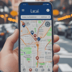
A mobile-friendly Google Business Profile drives foot traffic. A local service client of Premium SEO Firm updated their profile with photos and a Contact Now button, adding 25 weekly inquiries. Outdated profiles hurt rankings. Use Google’s Business Profile Manager for Pixel 8 optimization.
Driving Foot Traffic with Reviews
Reviews boost local SEO. A client of Premium SEO Firm encouraged reviews, adding 30 weekly mobile clicks. Respond promptly and use review schema markup. Ignoring reviews weakens trust—a mistake to avoid.
Geo-Targeting Mobile Ads
Geo-targeted ads amplify reach. A client’s “SEO services near me” campaign added 12 daily visitors. Use Google Ads’ location targeting, tested on iPhone 15, to capture local traffic.
Voice Search: The Mobile Future
Voice search favors conversational phrases. A consultancy client of Premium SEO Firm added “Where can I find complete SEO services nearby?” to their FAQ page, landing 40 more daily mobile visitors. Neglecting voice search misses traffic. Use AnswerThePublic for niche queries.
Targeting Long-Tail Queries
Long-tail queries like “affordable SEO services near me” drive leads. A client optimized for these, adding 15 weekly signups. Include questions in content, tested with Siri on iPhone 15, to capture voice-driven traffic.
Optimizing for Featured Snippets
Voice search pulls featured snippets. A client’s “What are the best SEO agencies nearby?” snippet added 10 daily clicks. Use concise, bolded answers (Top-rated SEO audits) to win snippets, avoiding missed opportunities.
Testing and Monitoring Mobile Performance
Untested sites risk failure. A client of Premium SEO Firm tested a larger Contact Us button on iPhone 15, adding 12 weekly submissions. Use Google Optimize for A/B testing and monitor Core Web Vitals in Search Console.
Monitoring Core Web Vitals
Cumulative Layout Shift (CLS, visual stability) affects rankings. A client fixed CLS issues, keeping 15 daily visitors. Use Lighthouse on Galaxy A13 to maintain stability, avoiding performance pitfalls.
Simulating Real-World Conditions
Simulate real-world use with WebPageTest on Motorola Moto G Power, catching 3G-specific issues. A client’s untested site lost users to slow loads, fixed by optimizing assets, adding 8 daily inquiries.
| Tool | Purpose | Cost | Use Case for Small Businesses |
|---|---|---|---|
| Google PageSpeed Insights | Measures load speed, LCP, CLS | Free | Identify speed bottlenecks on mobile devices like iPhone 15. |
| Lighthouse | Simulates low-bandwidth, audits performance | Free (Chrome DevTools) | Test 3G performance on devices like Motorola Moto G Power. |
| BrowserStack | Emulates devices for testing | $39/month (basic plan) | Ensure compatibility on Pixel 8, Galaxy Z Fold 6, and low-end devices. |
| Google Optimize | Runs A/B tests for UX | Free | Test button sizes or layouts to boost conversions. |
Accessibility for All Mobile Users
Accessible sites boost SEO and reach. Screen readers like VoiceOver need ARIA labels and alt text. Our SEO agency added alt text to client images, adding 18 weekly mobile visitors. Inaccessible sites exclude users. Use WAVE on iPad Pro.
Simplifying Forms for Accessibility
Complex forms deter assistive tech users. A client simplified fields, adding 10 weekly submissions. Ensure clear labels and keyboard navigation, tested on iPhone 15, to avoid accessibility gaps.
Supporting High-Contrast Modes
High-contrast modes aid visually impaired users. A client enabled high-contrast CSS, improving usability for 8% of mobile visitors. Test with Chrome DevTools, sidestepping accessibility oversights.
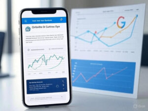
Using Analytics to Refine Mobile SEO

Analytics reveal mobile behavior. A client of Premium SEO Firm found slow service pages losing 25 daily visitors via Google Analytics. Optimizing them added 15 weekly leads. Use mobile reports and Hotjar heatmaps to refine flow.
Segmenting Mobile vs. Desktop Traffic
Mobile users favor quick actions. A client streamlined mobile contact forms, adding 20 weekly inquiries. Segment traffic in Google Analytics to spot patterns, avoiding missed opportunities.
Analyzing User Flow Drop-Offs
Drop-offs pinpoint weak spots. A client’s contact page lost 18 daily users, fixed by simplifying navigation. Use Google Analytics’ Behavior Flow to ensure smooth journeys.
| Metric | Definition | Target | Tool to Measure |
|---|---|---|---|
| Largest Contentful Paint (LCP) | Time to load main content | <2 seconds | Google PageSpeed Insights |
| Cumulative Layout Shift (CLS) | Visual stability score | <0.1 | Lighthouse |
| First Input Delay (FID) | Time to respond to user input | <100ms | Lighthouse |
| Bounce Rate | % of users leaving after one page | <40% | Google Analytics |
Social Media Integration for Mobile Traffic
Mobile-friendly social links drive traffic. A client’s Instagram bio linked to a mobile-optimized landing page, adding 25 daily visitors. Unoptimized links frustrate users. Use Linktree for TikTok, tested on Galaxy S23.
Linking to Mobile-Optimized Landing Pages
A desktop-only landing page lost mobile clicks. Optimizing for mobile added 15 daily leads. Create lean landing pages with fast CTAs, tested on iPhone 15, to capture social traffic.
Leveraging Stories and Reels
Instagram Stories drive visits. A client’s Reels campaign added 12 daily clicks. Use vertical, fast-loading visuals, tested on Pixel 8, to avoid losing social-driven users.
Security for Mobile Trust
HTTPS builds trust. One of our clients switched to HTTPS, adding 10 daily inquiries. Unsecured sites scare users and hurt rankings. Use Let’s Encrypt for free SSL, tested on iPad Pro.
Implementing HTTPS for Trust
An unsecured site lost bookings. Implementing HTTPS via Cloudflare boosted trust, adding 12 weekly inquiries. Verify with SSL Checker to avoid security lapses.
Securing Mobile Forms
Unsecured forms deter users. A client added HTTPS to forms, increasing submissions by 15 weekly. Use secure APIs and test on Galaxy S23, sidestepping trust issues.
Beyond the Basics: Advanced Mobile SEO
Dynamic rendering serves mobile-optimized content to crawlers. Structured data like schema.org’s LocalBusiness enhances snippets, adding 15 daily clicks for a client in “near me” carousels. Test on low-end devices and debug CLS with Chrome DevTools for a polished experience.
Industry-Specific Mobile SEO Strategies
- Retail: Use WebP images and Stripe’s mobile SDK for one-tap checkouts.
- Hospitality: Prioritize bold Reserve Now buttons on booking forms.
- B2B Services: Optimize whitepaper downloads with fast forms.
- Education: Ensure video players, like Vimeo, load swiftly for courses.
- Local Businesses: Boost “near me” searches with a Google Business Profile. Use Linktree for TikTok landing pages.
| Action | Retail | Hospitality | Local Businesses |
|---|---|---|---|
| Optimize images to WebP | ✓ | ✓ | ✓ |
| Use bold CTAs (e.g., Reserve Now) | ✓ | ✓ | ✓ |
| Mobile-friendly Google Business Profile | ✓ | ✓ | ✓ |
| Linktree for social landing pages | ✓ | ✓ | ✓ |
| Test on low-end devices (e.g., Galaxy A13) | ✓ | ✓ | ✓ |
Frequently Asked Questions About Mobile SEO
How often should I update my mobile site?
Update quarterly. Update your mobile site quarterly to align with Google’s algorithm changes and new device trends (e.g., foldable phones). Check Core Web Vitals monthly via Search Console to catch issues like CLS spikes. Test on new devices, like iPhone 15 or Galaxy Z Fold 6, annually to ensure compatibility. Regular updates prevent performance drops and keep your site competitive.
How much does mobile SEO cost for a small business?
Mobile SEO costs vary. Basic optimizations, like using free tools (Google PageSpeed Insights, Cloudflare), cost nothing but time. Hiring a professional for custom work, like responsive design or PWA setup, may run $500–$2000, depending on complexity. For small businesses, starting with free tools and gradually investing in premium options like WP Rocket ($59/year) balances cost and impact.
Does mobile SEO differ across browsers?
Browsers vary. Browsers like Chrome, Safari, and Firefox handle rendering differently. Safari on iPhone 15 may struggle with certain CSS animations that Chrome on Galaxy S23 handles well. Test with BrowserStack to ensure cross-browser compatibility, focusing on button sizes and load times. Ignoring browser differences can lead to inconsistent user experiences, so prioritize universal performance.
Can I handle mobile SEO without technical skills?
Absolutely. Tools like Google’s Mobile-Friendly Test and Cloudflare’s free CDN require minimal expertise. Follow step-by-step guides (e.g., add a viewport meta tag) to optimize. For complex tasks like PWAs, consider affordable freelancers via platforms like Upwork. Start with free resources and scale up as your business grows, ensuring accessibility without deep tech knowledge.
How do I measure mobile SEO success?
Track metrics. Track metrics like mobile traffic, bounce rate, and conversions in Google Analytics. Monitor Core Web Vitals (LCP <2s, CLS <0.1) via Lighthouse. Success shows in higher rankings for “near me” searches and increased leads. For example, a mobile-optimized landing page might double daily form submissions. Regular analysis ensures your efforts pay off.
The Mobile-First Mindset That Builds Trust
Your mobile site is your brand’s first impression—make it count. A fast, responsive design with intuitive content, a strategy we refine at Premium SEO Firm, doesn’t just boost rankings; it earns loyalty. Don’t settle for a site that limps along. Run Google’s Mobile-Friendly Test today and build a mobile experience that makes your business the go-to choice in 2025, turning every tap into a lasting connection.
Talha Rehman is a seasoned SEO expert with over a decade of experience and the Founder & CEO of Premium SEO Firm. He delivers complete white-hat SEO services with a focus on manual blogger outreach, ethical link building, and sustainable organic growth. Talha is passionate about writing in-depth articles on the latest SEO trends, algorithm updates, and proven digital marketing strategies.